About project
Atrium2023Client work
A long road into the game, walked one obvious step at a time.
Atrium is an online role-play game for mobile in the spirit of GTA, made for a Russian-speaking audience. I designed the launcher and sign-in, character creation, and a casino card mini-game played inside the open world. Each of the eleven mandatory steps became one screen with one action, and the casino states its risk before the first bet.
- Role
- UI/UX designer: entry flow and mini-game
- Client
- Atrium · online role-play game
- Platform
- Game · Mobile
- Tools
- Figma
Challenges
Before a player sets foot in the city, the game asks for a password and a passcode, recovery by phone, email, Telegram or VK, confirmation and authenticator codes, a referral nickname, then gender, race, skin and clothes. Together the steps read as a questionnaire. The job was to make a long road feel like a series of single, obvious moves.
- Landscape phone screens, in Russian first
- Eleven steps of sign-in, security and character creation before the first minute of play
- A mini-game with bets, three difficulties and a cash-out, inside the open world
- A dark mood set by the genre: condensed capitals and very little colour
- The player
- came to play a GTA-style city, not to fill in forms. Every screen that looks like paperwork is a reason to leave.
- The security
- still needs a password, a passcode, recovery and two-factor codes, because the account holds in-game money.
- The casino
- has to be tempting enough to play and honest about the risk: one wrong guess loses the whole bet.
Solutions
- 01
Tabs gave way to one action per screen
The first version put sign-up and log-in on tabs over a form-heavy column. The second split them: every step is one screen with one action, the character on the left, the field and the button on the right. Password rules and account recovery sit in a hint under an icon, out of the way but not lost.
Trade-offMore screens and more taps in total. Each tap is obvious, though, and the character on every step keeps the game in view the whole way.
- 02
The character is always in the frame
I gave gender, race, skin and clothes each its own way of choosing: two large tiles for gender, a map of regions for race, arrows with the neighbours visible for skin, categories with previews for clothes. One thing is shared: the character is always in the frame and changes at once, without a separate preview screen.
Trade-offFour different pickers are four patterns to learn. Each is matched to its choice: two options want tiles, dozens want browsing.
- 03
Two numbers run the round, the risk comes first
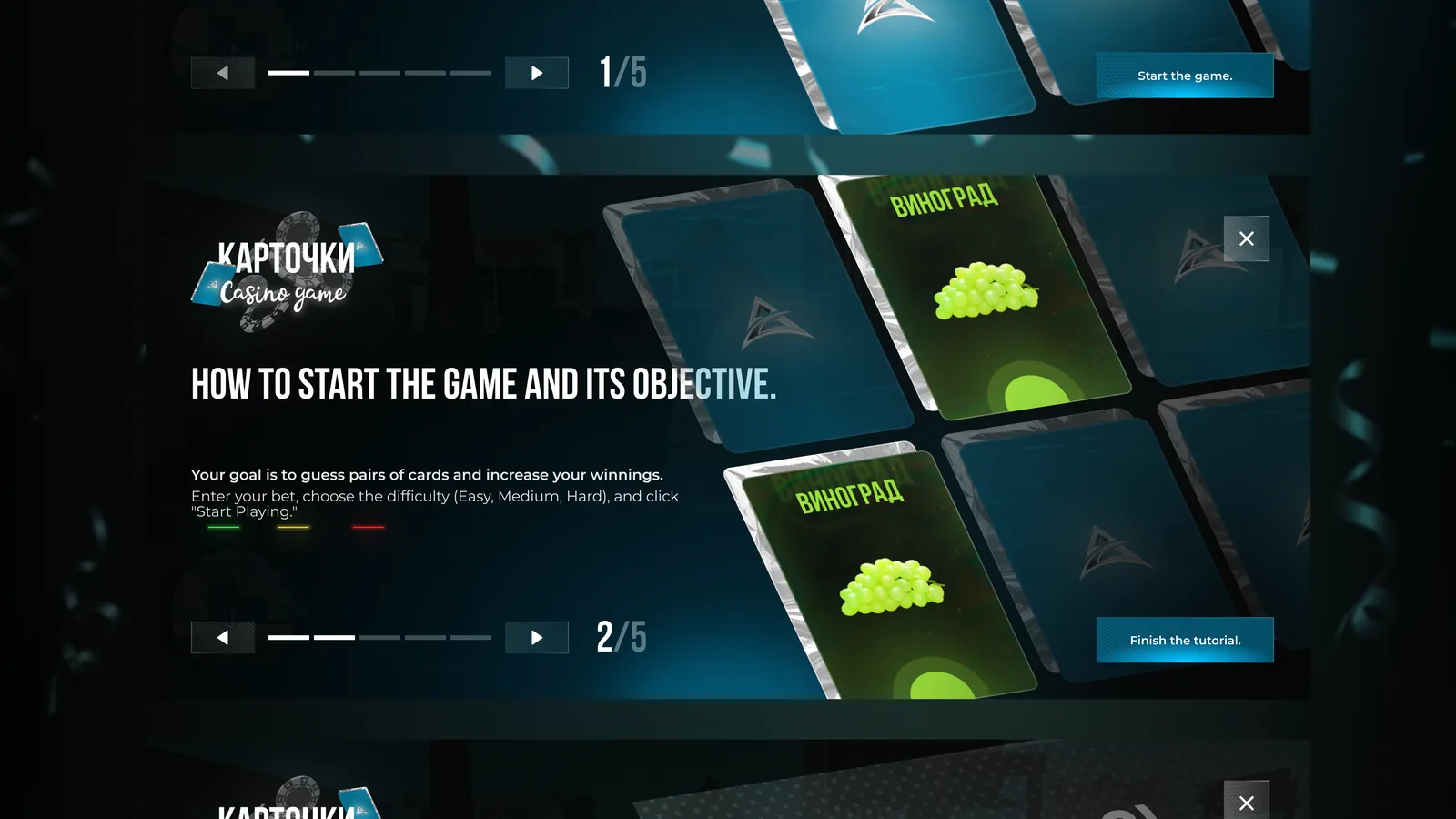
A round is a gamble: bet, pick a difficulty that sets the field, find pairs, watch the pot grow with the streak, cash out at any moment. I built the screen around two numbers, pairs guessed and the possible win. A five-slide tutorial says plainly that a wrong guess loses the whole bet.
Trade-offThe bet and difficulty controls get quieter at the edges, and five slides ask for patience before a mini-game. Where a wrong move costs in-game money, clarity about the rules comes first.
- 04
Every outcome got its own state before hand-off
I built fields, code inputs and buttons as components with their states, errors, hover and disabled included. The mini-game covers every outcome: the easy, medium and maximum fields, a loss, a win and a grand win with a cash-out timer. I animated the card flip in Figma to show how a round actually feels.
Trade-offDrawing every state and animating the flip cost about as much as the screens themselves. It is also why the hand-off needed no second round of questions about what happens when a player is wrong.
Results
A long, mandatory way in reads as a sequence of single moves with the character always in view, and the casino states its risk before the first bet.
Reflection
- A long mandatory road is survivable if every screen asks for one thing. Eleven steps did not need shortening, they needed splitting.
- Keeping the character in view through sign-up turns paperwork into getting ready to play: the same eleven screens with a different feeling.
- Where a wrong bet costs real in-game money, stating the risk before the first move is not friction. It is the reason anyone places a second bet.