About project
Big Arcade2024Client work
A shooter HUD that talks back, and a landing that looks like an arcade.
Big Arcade is an online arcade where games pay out: players climb the leaderboard and earn money. In early 2024 I designed, on my own, a livelier HUD for its first-person shooter. The team liked it and came back with a second job, the arcade's landing, which I showed as a three-page video prototype.
- Role
- Game UX/UI & Web Designer, solo
- Client
- Big Arcade · play-to-earn arcade
- Platform
- Game · Web
- Tools
- Figma, Photoshop
Challenges
The team found the design of their shooter dull and low on interaction, and the dev team had already sketched what a new HUD must show. The HUD had to turn that sketch into something a player reads at a glance while aiming, and a viewer enjoys watching.
- A dev team sketch as the starting point
- The game's own scene and gun stay behind the HUD
- Modern, dynamic and colourful, for a younger audience and viewers on stream
- The player
- aims at targets and needs the level, the bullets left and their standard without looking away.
- The viewer
- watches someone play on a stream and should see a great shot land.
Solutions
- 01
Corners for the basics, the meter on top
The sketch stacked the level, the meter and the bullets down the right edge. I moved the level and the bullets to the bottom corners, where shooters usually keep them, and laid the meter along the top.
Trade-offOn its side, the meter loses the brief's picture of purple at the top: a better standard reads to the right, not up.
- 02
Hit quotes drawn two ways, so play can decide
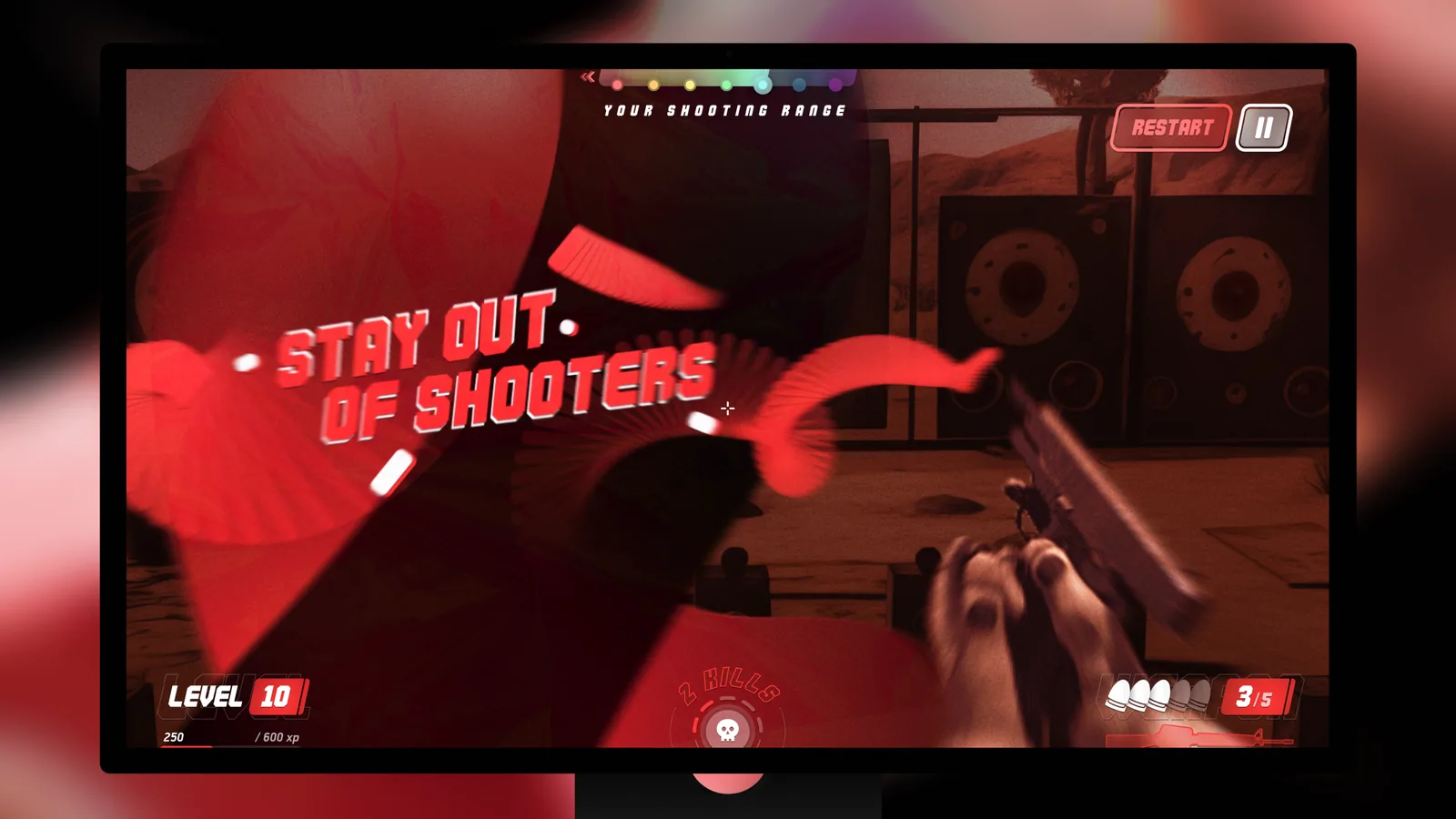
The team's example put the quotes across the whole screen. I drew that version and a quieter one with small notes at the side, so the choice could wait for real play.
Trade-offTwo sets of states to design and build, and the full-screen one covers the range while the player is aiming.
- 03
Extras the brief did not ask for
Restart, pause and a kill counter were not in the sketch. I added them where the basics left room: restart and pause at the top right, kills at the bottom centre.
Trade-offEach extra competes with the basics for attention, and the kill counter shares the screen's centre line with the crosshair.
- 04
Too close to the current site, so start over
My first landing direction came back as too close to the current site, and the team asked for something completely new. I started over with a pixel-arcade look.
Trade-offStarting from scratch drops what regular players already know about the site, and pixel type is harder to read in longer paragraphs.
From the brief
I kept the sketch's notes, not its layout
The dev team's brief was a sketch with three notes: show the level, add a meter coloured from red to purple that shows the player's shooting standard as an average, and a graphic for the bullets left. All three made it into the HUD, pass by pass.
The HUD, pass by pass
HUD
Numbers at the edges, the middle kept for aiming
The final HUD keeps the middle of the range for aiming. Down the left run an aim trainer's numbers, from score and headshot streak to times in milliseconds. I kept it close to the style of the arcade's other games, so the shooter reads as part of the arcade, not as a game with its own look.
Shooting range
- Red#FF3A3AThe bottom of the range
- Orange#FFB038
- Yellow#F9E852
- Green#63FC7B
- Cyan#6FFAF1
- Blue#2D8EE7
- Purple#B71DFFThe top of the range
Accents
- Red#FF3A3AA miss, restart and the kill counter
- Purple#B71DFFA great shot
- White#FFFFFFNumbers and the pause button's outline
- HUD
- CommandoLabels, most numbers and the hit notes
Hit notes
Purple for a great shot, red for a miss
The team wanted hits answered with damage numbers and short quotes. Small notes at the side leave the target in view, are colour-coded, and can name where the hit landed. The full-screen version is louder on a stream.
Landing
From dull and corporate to a pixel arcade
Next the team asked for the arcade's website, which they found a little dull and corporate. It had to be younger and more gamer-friendly, with nicer colours, and show the top earners table and a link to the public alpha.
- A pixel-arcade look: near-black and electric indigo, with pixel type
- An arcade cabinet and a gamepad on the first screen
Three pages
Results
The team liked the HUD and came back with a second job, the arcade's website, which I showed as a three-page video prototype.
Reflection
- Following a sketch's requirements does not mean copying its layout: all three notes stayed, just not on the right edge.
- When it is unclear how a feature will be used in play, two options give the team something concrete to choose from.
- When feedback says a redesign is too close to what exists, start over rather than restyle further.